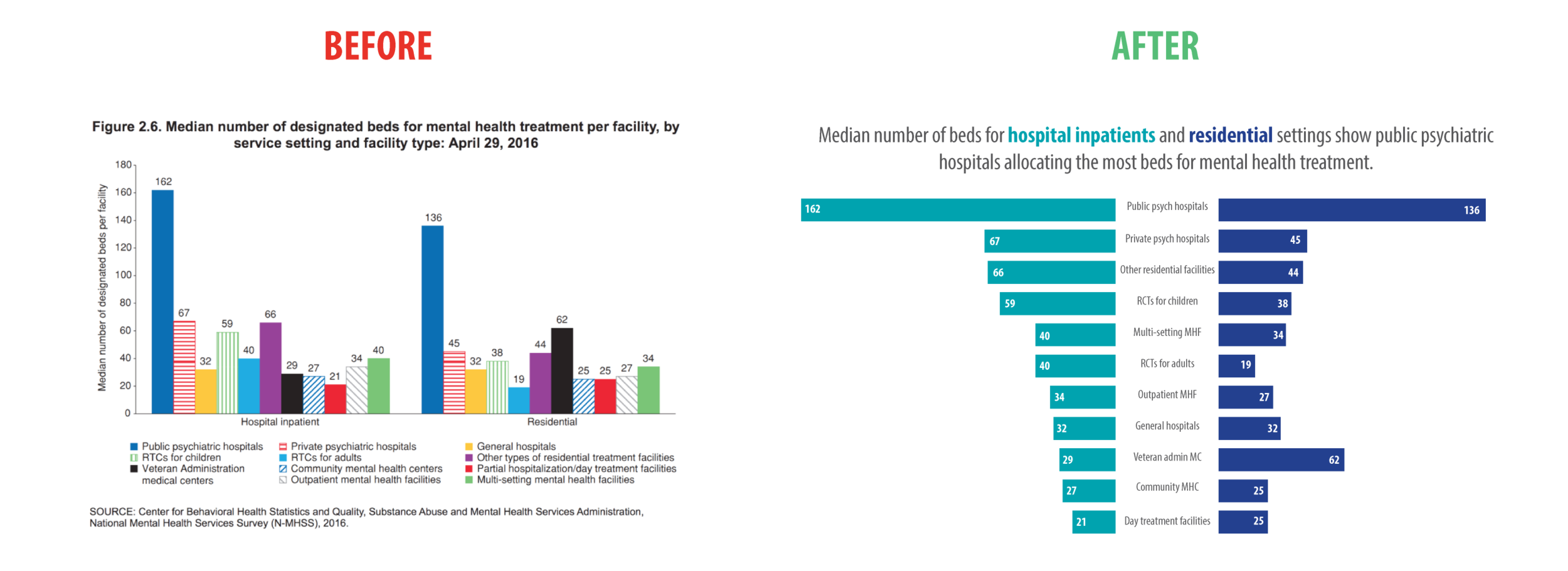
In a recent presentation I gave on creating research impact using infographics and data visualisations, I displayed this terrible bar chart (found at https://viz.wtf/ – very funny site) as an example of what not to do.
Before. Found at https://viz.wtf/
As you can see it’s far too cluttered and busy and your eyes don’t know where to look. It’s hard to draw meaning from something this messy and your audience will probably give up before your message is properly communicated. We would be in serious trouble if this was to be printed in black and white. So, I suggested to the group that as we are comparing two groups, each with their own sub categories, we might think about turning this into a back-to-back bar chart. I left it at that.
After the presentation I thought I should put my money where my mouth is and actually create a back-to-back bar chart from this data to show how it should be done.
This is what I came up with...
After. Designed by Alana Pirrone
Let me walk you through what I have done.
Before I begin, let me add that I created this in InDesign. I have included a tutorial below on how to create a back-to-back bar chart in Excel from Stephanie Evergreen.
Step 1
So first off, I organised the ‘hospital inpatient’ group from largest to smallest. This was no mean feat trying to match the eccentrically coloured columns with the tiny coloured legend at the bottom. You can see I have scrubbed out the Y axis on the left as we already have the values in the rows, we don’t need them twice. Bar graphs always look better and are easier to comprehend when the data are ordered. It’s less work for our brains to do.
Cut the clutter and start to organise.
I had to use a condensed font to squeeze in the 11 categories and even used some abbreviations. I then filled the data in the first bar graph. I used one colour only and put the exact values at the end of the column so there is no ambiguity.
Step 2
Step 2 was to make the next bar graph (‘residential’) on the right, making sure I had matched up the categories correctly. It was unlikely that the data would be largest to smallest in this category, but that was only necessary in the ‘hospital inpatient’ group to guide our initial design.
Again, I put the exact values into the rows so we wouldn’t need an axis or grid lines. You can now clearly see the patterns in the data and it’s a lot easier to follow and draw comparisons between the two groups.
Step 3
One thing in particular that I learnt in Stephanie Evergreen’s course was to display a heading that draws clear conclusions from your data. Tell your audience what you want them to see in the data. As I don’t know by whom or why this visualisation was created or what message they wanted to tell, I’m going to pretend and pull my own message from the data.
I have colour coded the two groups ‘hospital inpatients’ and ‘residential’ to relate to their respective bar charts so there is no need to put a key in.
If I only wanted to focus your attention, just say, on the lack of beds assigned for mental health treatment in general hospitals, I can grey out all the other data and draw attention to the ‘general hospitals’ row. This is especially effective if you are using it in a presentation. All your other data is there for comparison, but you are telling your audience exactly where you want them to focus.
So there you have it. A few easy steps to follow and we have turned something horribly busy into an easy to comprehend visualisation.
To learn how to make a back-to-back bar chart in excel, here is a tutorial from Stephanie Evergreen: https://stephanieevergreen.com/making-back-to-back-graphs-in-excel/
If you are interested to learn more about data visualisation, please take a look at my one day short course Design and Data Visualisation for Knowledge Translation. This course is designed to teach individuals ways to translate and present their work into creative and compelling visualisations. No design experience necessary.


