Our team has been working in partnership with the Doherty Institute on a longitudinal, nation-wide survey. The aim is to gain an understanding how Australians are thinking, feeling and behaving in relation to the COVID-19 pandemic and the distancing measures in place. A series of rapid reports are being produced to help decision makers in real time and you can read the full reports here. I was lucky enough to work on the design and layout of the second report.
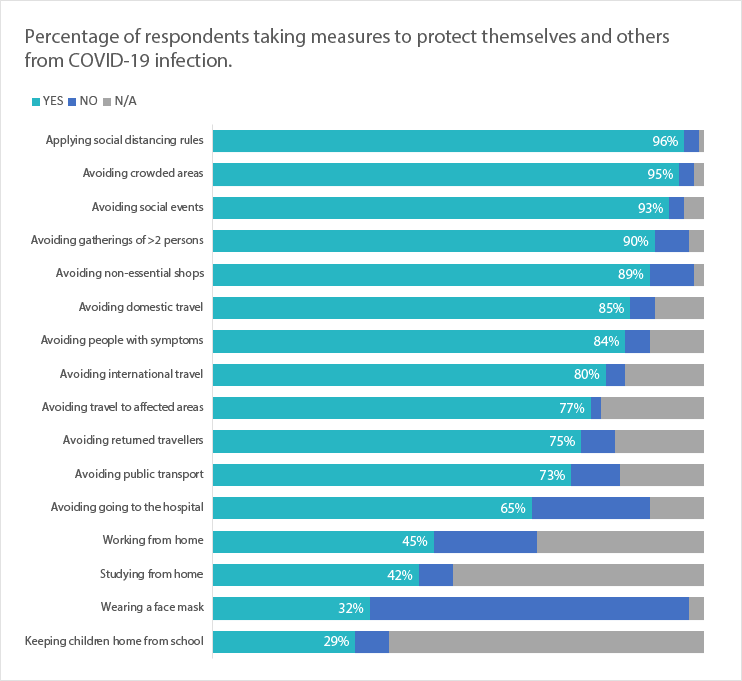
There were a number of charts produced through the analysis by the very talented data analysts on the team. One such chart is below. Can we take a moment to recognise the great colours used! The rapid turnaround of this report limited the time available for design, but now that I have had some breathing space I thought I would show you some alternative ways the information in this chart could be displayed.
100% stacked bar
There is a lot happening in the chart and a lot to take in. We can see from the outset that the large chunks of green indicate that a lot of people have changed their behaviour in relation to the pandemic. The green and the purple have a common baseline which makes it easier for us to compare lengths, but the blue category caught in the middle is a little more difficult.
When I was formatting the report, I thought this would be an excellent example of how we can transform the chart to incorporate data storytelling.
What is data storytelling?
Data storytelling isn’t about counting how many breaths the big bad wolf took to blow down the three little pigs house and charting that. Or using statistical analysis to find where exactly the green sheep is, and where it might go next.
Data storytelling is finding a story behind your data and chart, and explaining that to your audience. It’s about turning your chart from an exploratory one, where you let the audience find their own meaning, to an explanatory one where, you tell them what’s important and what you would like them to take away from the chart. Ann K Emery and Cole Nussbaumer Knaflic are the real leaders in this space.
I redesigned this chart twice , then transformed each from a traditional chart into a data storytelling chart. The good news, it was 100% done in Excel!
Chart 1 – 100% stacked bar chart.
Sticking with the original concept, I used a 100% stacked bar to show behaviour change. I made one small modification which totally transforms the chart, that is ordering the first category (yes) from largest to smallest.
100% stacked bar showing behaviour change
I’ve included percentages for the yes category to give some reference. The chart appears a little more ordered now. But it’s still an exploratory chart. I leave the audience to look through and find what’s important.
Let’s take it one step further now and make it into a storytelling chart.
Using data storytelling to show our audience what is important
What did I do?
I greyed everything out.
I decided on the story I’m going to tell. In this case, my story was the majority of people did change their behaviours to some degree and thus helped protect themselves and others from the virus.
I drew attention to this by using my action colour teal to highlight the ‘yes’ category.
I wrote a full sentence heading that describes that point.
I added an extra element by placing annotations next to three bars in the chart that I thought were interesting.
The storytelling part of your chart also depends on the audience you are presenting it to. Using knowledge translation, we can identify our target audience and what aspects of the chart may be of most interest or useful to them. For instance, say I was applying for a research grant to explore whether the rate of serious illness diagnoses have decreased because fewer people have presenting to hospital for check-ups during the pandemic. I could use the above chart to show that and redesign it like this:
Storytelling chart highlighting a different point.
Again, I’ve pushed everything to the back and highlighted my story using colour, a completed descriptive heading and an annotation.
Chart 2 – Small multiple bar chart.
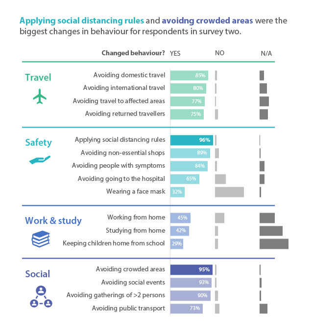
The second redesign uses small multiple bar charts. To help the reader, I have categorised the behaviours into four different groups; travel, safety, work and study, and social. Each group has their own colour. This breaks up the chart into smaller, more digestible chunks and makes it easier for our audience to walk their way through.
As I’ve mentioned before, people have a much easier time comparing lengths when reading charts, especially when they have a common baseline, hence my decision to go with small multiple bars.
Here is our traditional chart:
Small multiple bar chart
The chart is great but again, I have left it to the audience to find meaning. So, let’s tell them exactly what’s important:
Small multiple bar chart incorporating data storytelling
What did I do?
I greyed everything out.
I decided on the story I’m going to tell. Again, I wanted to focus on the behaviour change (‘yes’ category), especially the two highest categories; ‘applying social distancing rules’ and ‘avoiding crowded areas’.
I drew attention to this by leaving the yes category in colour but reducing the opacity to 50%. I left ‘applying social distancing rules’ and ‘avoiding crowded areas’ at 100% opacity, making them a bit brighter to the reader’s eye.
I wrote a full sentence heading that describes that point and used colour to link it to the chart.
This time I decided against an annotation as the chart was already quite busy.
Easy done! Your audience can’t miss the meaning now.
Using these 4-5 steps, you can transform your traditional chart into a storytelling chart making it super easy for your audience to read and interpret.
Happy designing!


