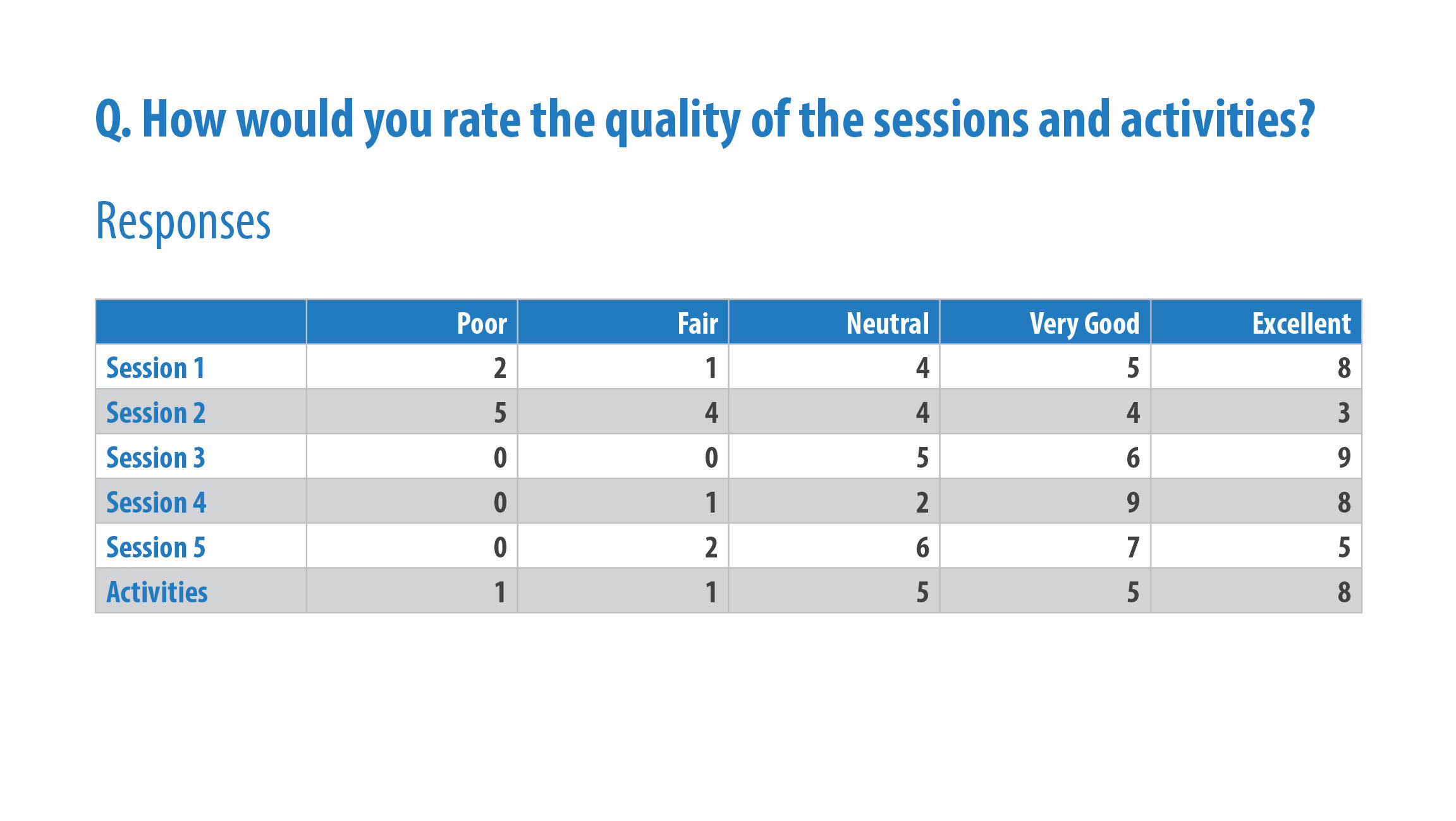
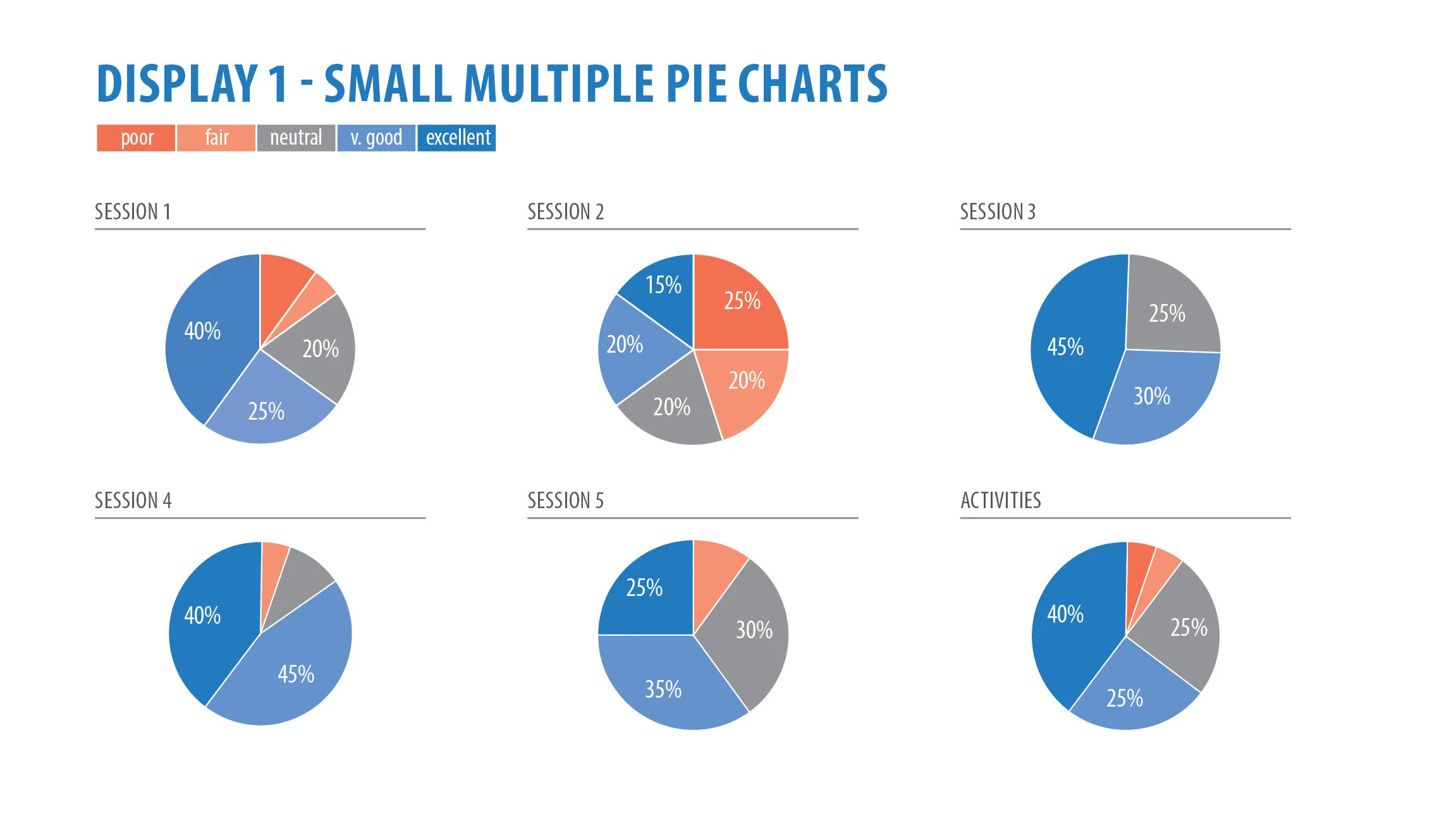
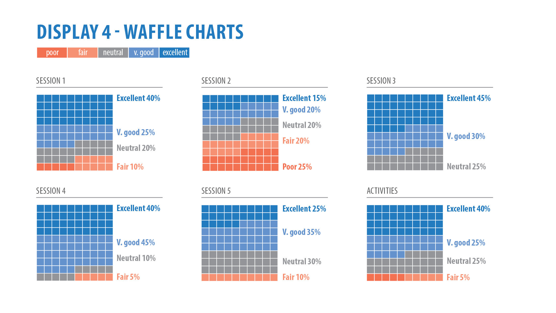
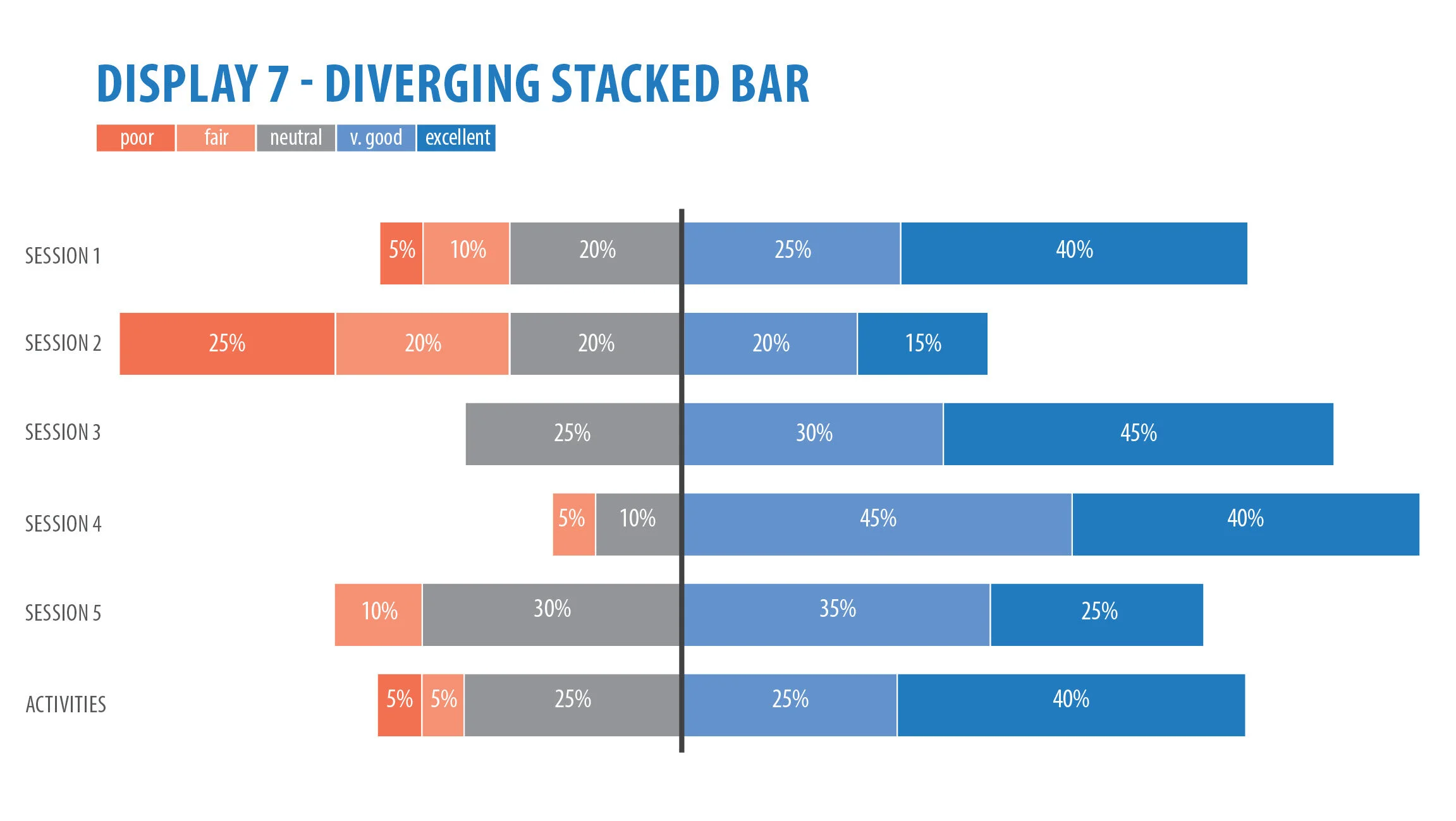
Take a look at this chart below. Let’s picture it in two different scenarios.
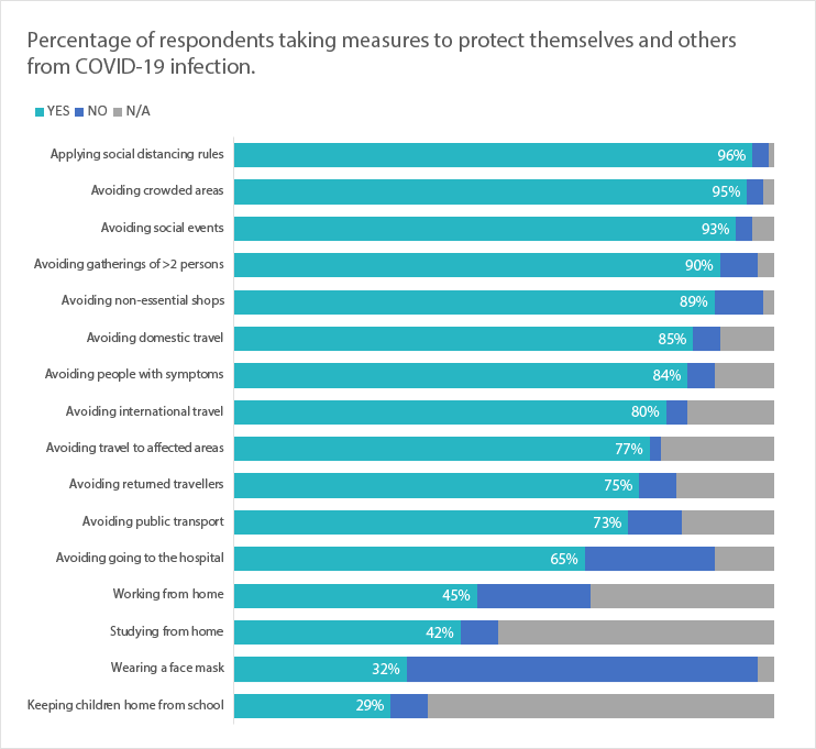
BEFORE: Horizontal grouped bar chart
Scenario one
It’s Monday morning. You grab your cup of coffee, sit down at your computer and start going through your emails. Your colleague has sent you an interim report on findings from their current research project. You scroll through, read the report and take time to understand and interpret the chart. “Excellent work”, you say. You go about your business.
Scenario two
Your same colleague has been invited to present the findings from the interim report. Being 2020, let’s say this is on Zoom. They have 15 minutes to get through about 20 slides, which leaves about 45 seconds per slide. One of the slides is the same chart. The chart appears. They keep talking, and you start trying to read, interpret and make comparisons between the categories. However, your concentration is broken because the presenter is still talking and what they are talking about is not where you are on the chart. Next minute, the slide changes. “I’m confused”, you say.
My point is when designing charts for your PowerPoint presentations, there are different considerations to designing for reports or infographics. With reports and infographics, you have a lot more time to read and digest the information. For presentations, we need to reduce the cognitive load and simplify the chart as best we can to illustrate the point.
So, what can we do?
The chart above was one that came from one of my awesome clients. The horizontal grouped bar is great and does everything a bar chart needs to. She has added data labels and removed all the background noise like the gridlines. But it still takes a bit of work to go back and forth from the key down the bottom and match up with the categories and how they perform against each other. Time is not usually a luxury we have in PowerPoint presentations.
AFTER: Small multiple horizontal bar chart
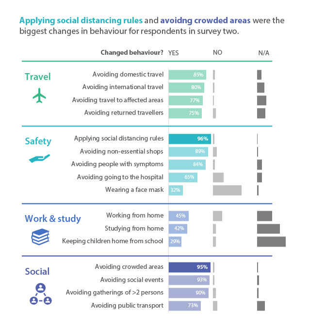
This is my redesign as small multiple horizontal bars.
What have I done?
I’ve made two horizontal bars sitting next to each other with the exact same dimensions (scale, height and width). The bars are bit thicker too. I’ve kept with my client’s chosen colours for male and female (and not conformed to the old pink and blue stereotypes) and added an icon next to the heading to aid in comprehension. The first category (female), I have listed from biggest to smallest. It makes the chart easier to read. I’ve then matched the categories for the male column for easier comparisons. Like the original, I have the data labels in there but have made them that little bit bigger. There is a big difference in the number of female and male participants, so I have kept those numbers in but subtly at the top.
A few easy changes and the chart is a whole lot easier to digest.
Let’s look at another slide before and after.
BEFORE: Horizontal grouped bar chart
AFTER: Small multiple horizontal bar chart
I can hear you asking, “Why have you been boring and done it in the exact same way”? Good question!
Remember: time is not our friend in a PowerPoint presentation. Even if the slide was up on screen for a while, we still want our audience to process the information as quickly as possible and then focus their attention back to us as the presenter. So, keeping the same type of chart and the same layout allows our audience a quicker processing time as they are already familiar with the chart and how to read it.
Other key things to remember when designing charts for PowerPoint presentations:
Remove unnecessary clutter from your charts, like gridlines, background colour, and borders.
Always label data directly to reduce any ambiguity. It’s harder for our eyes to scroll from the end of the bar to the X or Y axis to see the exact value.
Use the graphic design principle of hierarchy to order your chart. In Western culture we read from top left to bottom right, so lead your audience through with a large title on the top left.
Add icons where you can to aid in readability. Remember PowerPoint now has its own icons.
Use the real estate on your slide! Use the space you have been given. Don’t cram it into one corner.
Use data storytelling to focus your audience’s attention on a certain part of your chart and tell the story behind it.
Happy designing!

