Working with research and evaluations teams, I’m often faced with the question of how to effectively display Likert scale data. If you are not familiar with the term, a Likert scale, named after American psychologist Rensis Likert, measures a response to a close-ended question on a rating scale of how much you agree or disagree, often with a neutral option in between. A typical five-point scale may include answers: strongly disagree, disagree, neutral, agree, strongly agree.
I regularly use a five-point Likert scale format to evaluate my Design and Data Visualisation Short Course in order to gain specific feedback on how participants rated the quality and usefulness of each session. The challenge for a lot of people is that once they have collected the detailed data, how do they best display it in an effective way that is easy for their audience to understand and interpret?
This month, I decided to give myself a challenge. Take the same data, from a five-point Likert scale, and display it as many different ways as I could. I came up with seven different options, some much better than others. Let me walk you through.
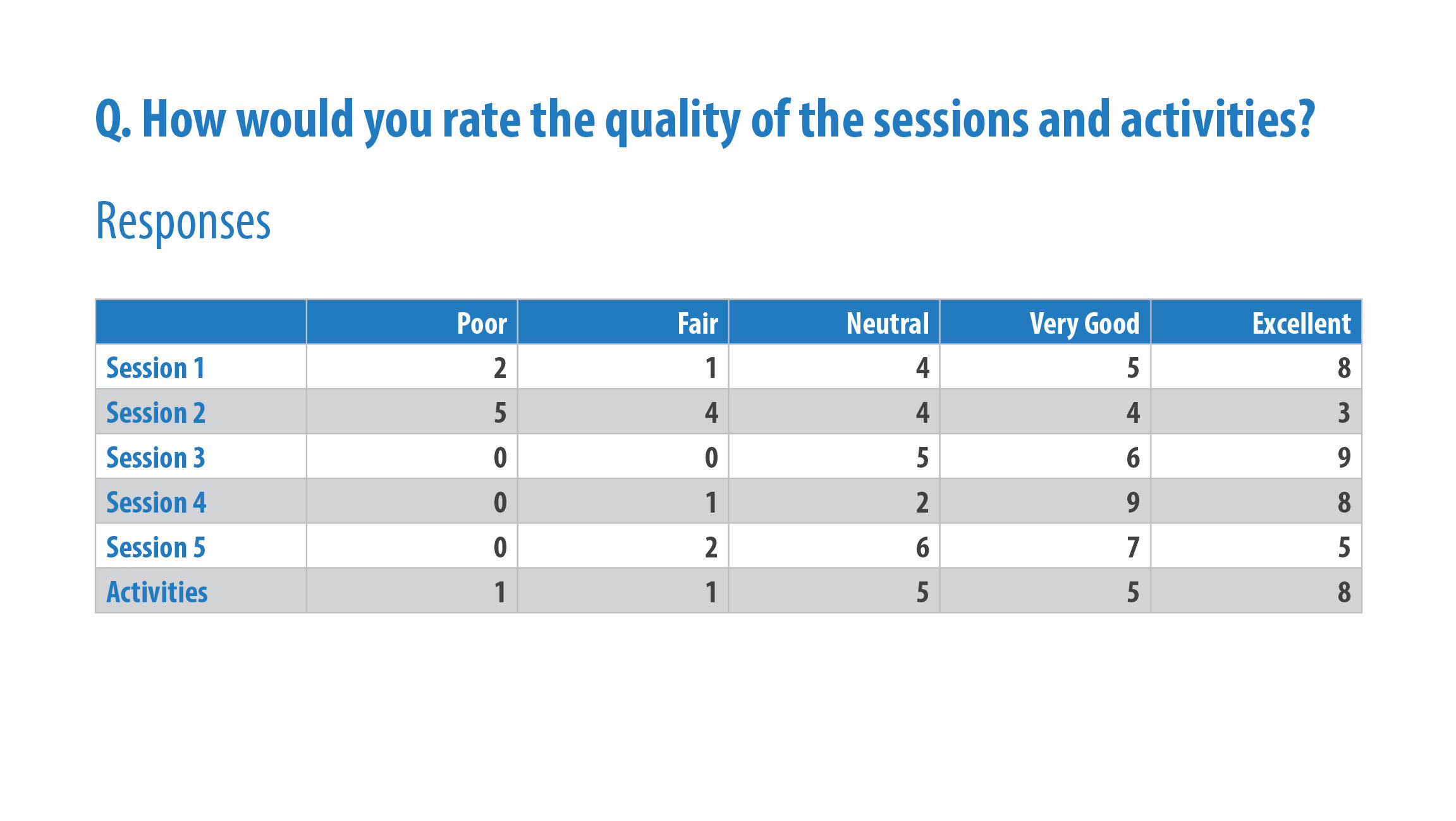
To begin with, this is the example data I have used:
Sample data displayed from the question ‘How would you rate the quality of the sessions and activities?'
I have made some specific design choices to maintain consistency throughout, including using blue to show positive ratings, grey for neutral, and orange for negative. In some charts I have used the actual value, and others have used the relative frequency (percentage).
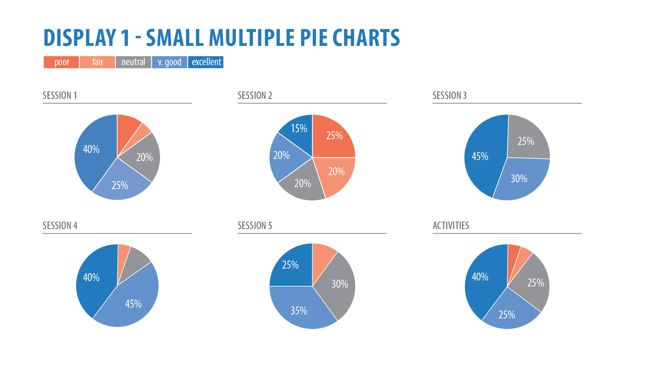
Display 1 - Small multiple pie charts
DISPLAY 1: SMALL MULTIPLE PIE CHARTS
The world is divided on pie charts. Many data visualisation specialists will tell you how evil they are, and I tend to agree with them. They are hard to read and interpret as they rely on our audience to decode the quantitative information by judging and comparing angles and area, which is actually quite difficult to do. However, in saying that, people still love seeing the part-to-whole relationship that a pie chart offers. Whatever your feelings are toward pie charts, I wanted to include them for argument’s sake.
I have used one pie chart for each session, showing the relative frequency of responses and colour coding it to the scale above. I’ve kept the wedges in order, starting at the top and going in an anticlockwise direction. I’ve directly labelled the wedges with their percentage but left off the smaller slices. The colour scale is simple and has enough contrast between the blue and orange that we can see differences, but we still may need to go back to the key for reference.
Our general view is that session two needs a lot of work. There is a large chunk of orange there. Session three is doing quite well, no orange in sight. It’s easy to compare within each session, but not between the sessions.
Display 2 - Grouped bar chart
DISPLAY 2: GROUP BAR CHART
If you’re like me and use google forms to collect evaluations, you’ll notice it produces a grouped bar similar to this. However, it normally colours each line with a different hue. Studies have shown that it is far easier for us to compare length and position (bar and line chart), than area and angle (pie and donut chart)1,2. On first glance at this chart, there is a lot to take in. We can see from an overall picture that again, there is more blue than orange, which is a good thing. Generally, the blue bars are quite tall, expect from session two. My eyes are also drawn to the big gap between session two and three, and it might take a while to see that there are no “poor” or “fair” responses there. Yes, we can now compare between all the sessions, but the chart may seem too overwhelming and require significantly more visual processing time, so we risk our audience skipping over it entirely.
Display 3 - Small multiple bar charts
DISPLAY 3: SMALL MULTIPLE BAR CHARTS
This display shows six individual horizontal bar charts with our Likert scale responses ordered from excellent at the top, to poor at the bottom. Again, the colour choice of blue and orange gives a quick overall view of the data and responses. In each chart, I have labelled the values directly and kept them all to scale. It is now a lot clearer to see that there are no responses for “fair” or “poor” for sessions three.
This is one of my favourite ways to display the data. We can easily see within each session how the responses vary, and if we want to compare between sessions, our eyes only need to scroll across the screen. In terms of visual hierarchy, we start with our session number (session one, for example) on the top left, then go down and read each category (starting with excellent) and follow it along to see its value (8) and how it compares to the bars below. As mentioned previously, we are much better at reading length and position and the general public already know how to understand and interpret a bar chart.
What if you want to display the data in a more modern, non-traditional way?
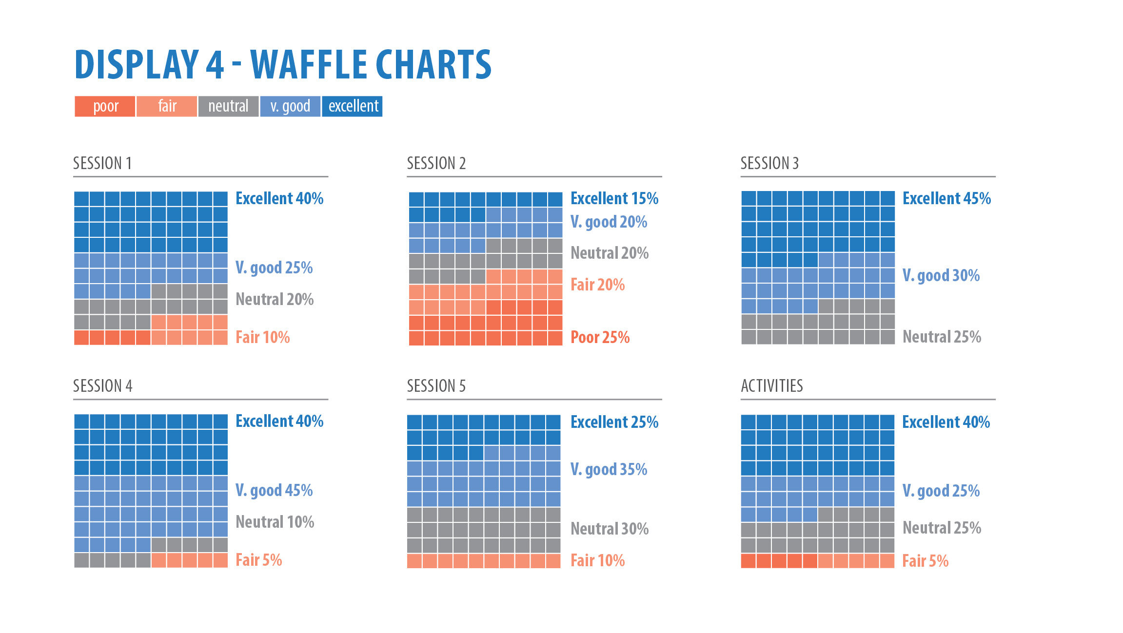
Display 4 - Waffle charts
DISPLAY 4: WAFFLE CHARTS
Waffle charts are usually designed with 10 or 100 squares to show the relative frequency of the given data. They are another great way to show the part-to-whole relationship that people love about pie charts. You could say they are a bit of a modern twist on traditional charts you would see in programs like Excel.
The thing I like most about this display is the gradual fade of coloured squares from blue to orange. We get a good overall picture of the data and responses, but at the same time, I think it’s vital we have the categories and values directly next to each section.
Display 5 - Large number and text
DISPLAY 5: LARGE NUMBER AND TEXT
Again, thinking a little outside the box gives us the large number and text option. It’s a great way to break up a lengthy, wordy report filled with too many dot point (or bullets).
From each session, I have made a judgement call on what I want my audience to focus on. I have combined the “very good” and “excellent” categories together in sessions one, three, four, five, and activities, as I see this as a positive response. Obviously, the thing to take away from session two is that there was an overwhelming number of negative (fair or poor) responses, and that’s where our focus should lie. I have been consistent and kept the positive responses blue and negative responses orange.
Display 6 - Stacked bar
DISPLAY 6: STACKED BAR
Now we’re getting to the pointy end of business. The next two charts are probably the most effective ways to display Likert scale data. A stacked bar belongs to the part-to-whole group of charts and has us displaying the percentage of responses in proportion to one another. The issue with this chart is we would normally have a common baseline on both the left hand and right hand side. A common baseline makes it easier for us to compare lengths of each bar (as they all start at the same point). In this chart, the common baseline is only on the right hand side for the “excellent” rating. Due to the nature of this data, the left hand side baseline starts with three different categories.
Like the other charts, an overall glance makes it easy to see where we are doing well, and where we need to make improvements. For ease of reading, I have labelled each percentage value directly.
There is one way we could improve this chart to make it easier to read and that brings us up to display seven.
Display 7 - Diverging stacked bar
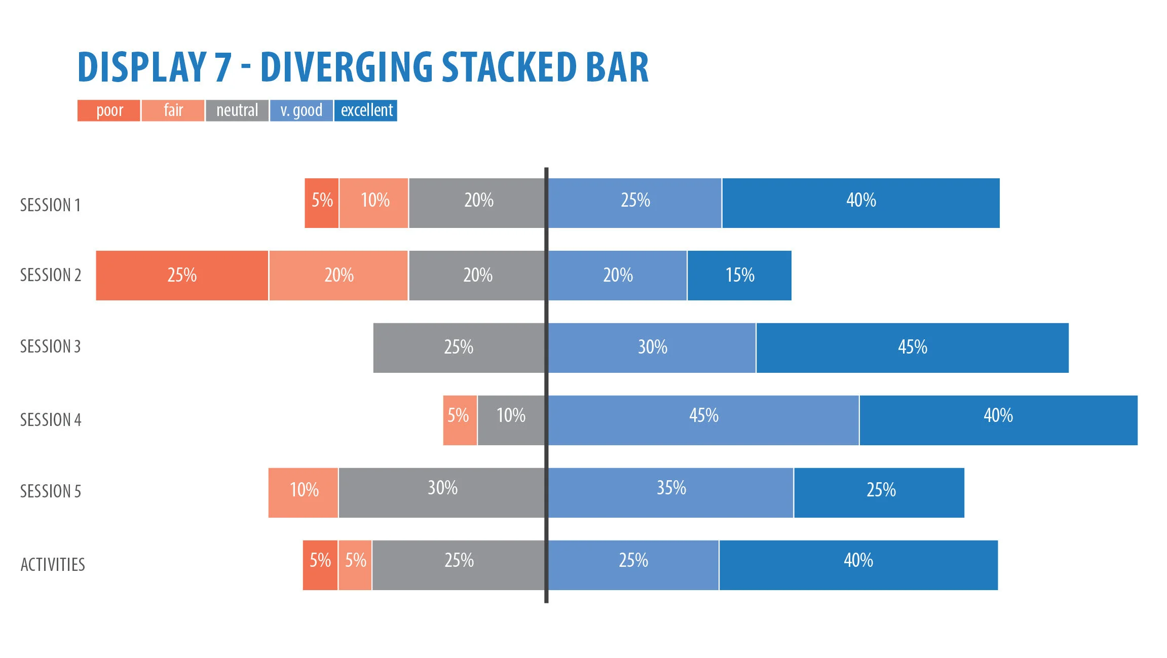
DISPLAY 7: DIVERGING STACKED BAR
The last option and the one I would highly recommend for this type of data is the diverging stacked bar. It’s essentially the same as a stacked bar but we are categorising the data into positive and negative categories by separating them with a thick visual baseline. In the above chart I am categorising “neutral” as a negative result. We can then measure our success or failure from that baseline, which acts as a kind of target.
It’s clear, effective and is able to show a large chunk of data neatly and succinctly. Compare this to the grouped bar above or the small multiple pie charts. Which one are you able to quickly pull meaning from?
In summary, I have presented you with seven different options for displaying your Likert scale data. There is no right or wrong answer, rather options for you to consider and get inspiration from. There are also many other things you need to consider before you start designing such as:
What medium are you designing for? Is it a report, PowerPoint slide, website, or one-page handout? How much space do you have for your charts?
Who is your audience? Will a diverging stacked bar confuse them?
What colours will you use to distinguish between positive and negative categories? Are your organisation’s branding colours too similar?
What message do you want to get across to your audience?
A lot to consider, but some options above to help your thinking. Happy designing!
References
Few, S. “Save the Pies for Dessert” Visual Business Intelligence Newsletter, August 2007.
Evergreen, S. Presenting Data Effectively, 2nd Edition. Sage Publications. 2018.

